Design is essential when you need to stand out and thrive in today’s competitive digital landscape. In the future of online shopping, the user experience is paramount. If your website appears outdated or is difficult to navigate, potential customers will likely abandon their purchase and seek alternatives.
While many eCommerce businesses rely on pre-designed templates, a truly distinctive and memorable online presence requires a more personalized approach. Investing in custom design can help you build a stronger connection with your customers and foster loyalty.
By prioritizing design, you can create a unique and engaging shopping experience that sets your business apart from the competition.
How can you tell if your eCommerce site needs to be redesigned? How does it set you back? What are the crucial stages of redesigning an eCommerce website? In this article, we’ll cover these topics.
Stats About User Experience, Website First Impressions, and Website Design That You Should Be Taking Very Seriously

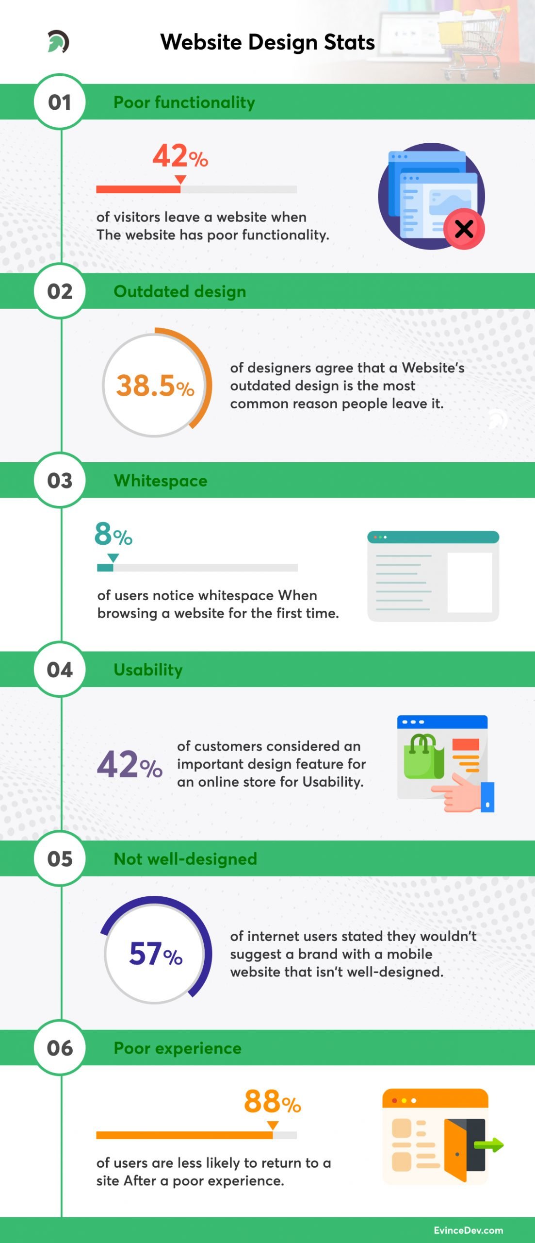
- A website’s poor functionality drives 42% of visitors to leave it.
- 38.5% of designers agree that a website’s outdated design is the most common reason people leave it.
- When browsing a website for the first time, just 8% of users notice whitespace.
- Usability is considered an important design feature for an online store by 60% of customers.
- 57% of internet users stated they wouldn’t suggest a brand with a mobile website that isn’t well-designed.
- After a poor experience, 88% of users are less likely to return to a site.
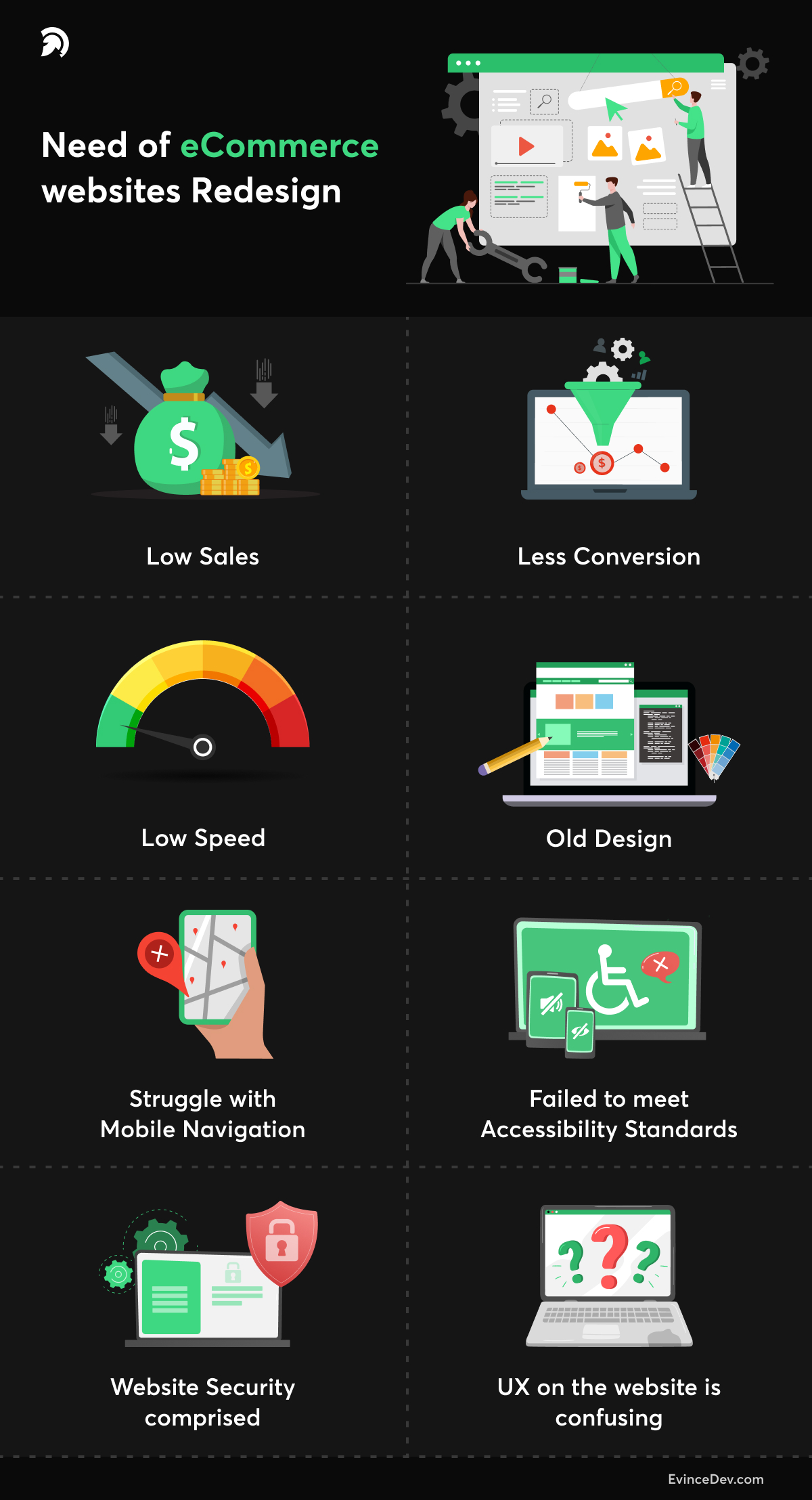
Why does your eCommerce website need Website Redesign?

1. Low Sales
A design flaw causes plenty of issues that limit sales, and Website visitors may become frustrated by lackluster performance, diminishing their chance of converting. You’ll like to rule out other aspects that could significantly impact before moving forward with a redesign.
It’s feasible that the products themselves, or their marketing, are to blame. Price may also be a consideration, especially if a competitor’s offering is less expensive. Determine the level to which a redesign can increase sales by identifying the most serious issues as soon as possible.
2. Less Conversion
A low conversion rate indicates that your eCommerce platform is not profitable to start successfully, and you should fix this issue as a result. So, if you’re having trouble converting website visitors into customers, you might want to explore a webshop redesign.
The conversion rate is directly influenced by your platform’s complex interface, poor design, low functionality, and poor performance. But don’t worry; an eCommerce redesign can help you solve this problem by providing your Website more user-friendly and enticing.
3. Low Speed
If they have to wait a few moments longer than expected, most people will quit websites. A slow website might be a significant liability. Make every attempt to meet the standard rule of thumb for a good load time of fewer than two seconds.
First, see if your page is taking too long to load. Using various tools, such as Google PageSpeed Insights, may analyze your page performance.
4. Old Design
When building an eCommerce website, failing to consider your target audience might negatively impact the user experience. As a result, thorough market research and identification of your target audience are essential for an updated design.
5. Struggle with Mobile Navigation
If your page isn’t built to suit the mobile shopping revolution, you miss out on an increasing audience. Many buyers will not make purchases from websites that have not been designed with mobile in mind.
When developing your mobile site, keep in mind that web pages must automatically resize to match various devices’ screens. Users are less likely to have to zoom in and scroll while using a responsive website constantly. You must also maintain consistency between desktop and mobile versions of your Website.
6. Failed to meet Accessibility Standards
Is the Website upgraded as per the WCAG (Web Content Accessibility Guidelines)? These allow the most extensive possible range of visitors to utilize your site, despite the physical constraints.
It covers a wide range of web design issues, including:
- It should avoid flashing visuals or blinking lights because they can cause seizures.
- The ability to use keyboards to navigate all aspects of the Website
- Text alternatives for thumbnails and other imagery have been added to assist visually impaired users.
- Media that is synchronized or time-based, as well as other interactive elements, must be linked.
- Content is distinguishable due to color contrast and responsive design.
If you are unsure that the current version of the Website delivers a consistent experience for all users, you should consider redesigning it.
7. Website Security comprised
Customers would like to know that the Website should process their data with care. Therefore, security should be a key focus in eCommerce web design and security work hand in hand, primarily if possible risks are handled.
Transparency is also essential. All users should know how your Website adheres to privacy rules and when and why their data is gathered.
8. UX on the Website is confusing
You might wonder what the primary indicators of a complex UX are. The following is a list of its essential indications. You should consider an eCommerce website redesign if your Website relates to two or more of these factors.
- It takes a long time for the page to load or react;
- The plugins aren’t well-integrated.
- Confusing navigation or several possibilities for navigating;
- The lengthy checkout procedure (there are so many stages);
- There is the insufficient spacing between informative blocks;
- The unavailability of a “search” option;
- Fonts that are too complex;
- The colors on the page don’t match.
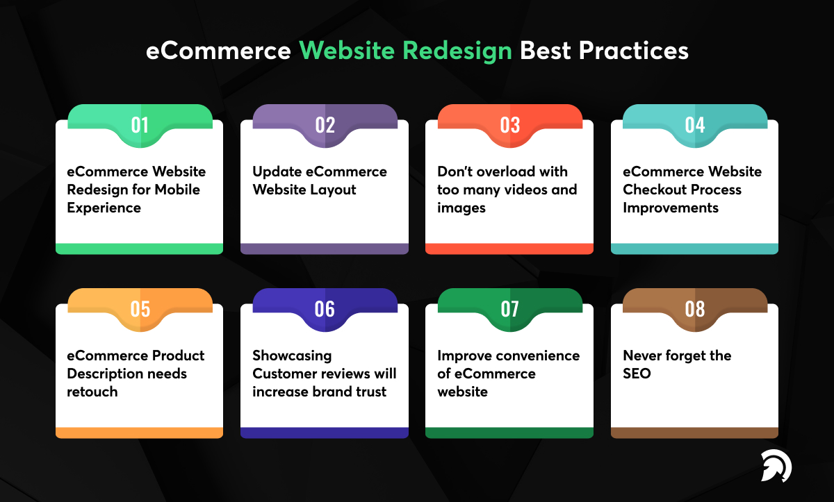
eCommerce Website Redesign Best Practices

1. eCommerce Website Redesign for Mobile Experience
Making an eCommerce website fully mobile-friendly is now a key concern. It shouldn’t matter what devices a visitor uses when they come to your site to do some online purchasing, and your Website should adapt to any screen size so that content is always visible.
- Make intentional yet non-obtrusive calls to action.
- Short menus and to-the-point data improve mobile browsing.
- Reduce the number of pop-ups and interstitials you utilize.
- Ensure your page loads quickly and has a good page speed.
2. Update eCommerce Website Layout
If you own a WordPress eCommerce site, you can avail of its flexibility and various tools to make changes as needed. This content management system allows you to change the appearance of your Website, which is essential for a modern-looking online business.
- Your eCommerce website design should have a clean, minimalist style.
- Simple designs are much more appealing and lead to higher conversion rates.
- Have a simple homepage with a single strong call to action.
- “Free delivery” should be prominently displayed.
- Place your best-selling products and services on the first page of your Website.
- Use customer information to improve user navigation & content paths.
3. Don’t overload with too many videos and images.
While it’s natural to want intriguing content, you must combine it with the demand for speed. Just show the most critical videos or images to keep load times minimum. It will make your page load faster, but it will also eliminate visual clutter.
Quality often wins out over quantity, so instead of stuffing your Website with many mediocre images, ensure that each one delivers the most value for money.
When in doubt, go for the lesser of two alternatives. In eCommerce, it might be challenging to do. It’s normal to provide customers with as much data as possible about products. There is no simple way to know how many photos are too many, but load time analytics is an excellent place to start.
4. eCommerce Website Checkout Process Improvements
The enhanced checkout procedure is one aspect of your online store website. Cart abandonment may cost your business a lot of money. You can keep new consumers on track with a few modest changes to your style and content.
- Create a smooth checkout procedure (add to cart > invoicing > delivery > preview > transaction > validation).
- Avoid adding additional fees and expenditures to your payment total (taxes, shipping).
- Only ask for the necessary information to make the purchasing process go well.
5. eCommerce Product Description needs retouch
Creative, unique product descriptions may make a massive difference in your online store. Customers enjoy researching a product before purchasing it and spend some time rewriting each description to reflect the tone and spirit of your company.
- On your eCommerce site, personalize each product description.
- Maintain attention to the descriptions by emphasizing significant benefits.
- For each product, use many high-quality graphics.
- Make use of bullet points.
- Avoid big blocks of text.
6. Showcasing Customer reviews will increase brand trust.
You should gather and showcase your most outstanding customer reviews if you want your eCommerce website design to stand out from the crowd. These social proofs help persuade new clients to purchase your products or services.
- Showcase your most vivid testimonials and reviews properly.
- Create methods for obtaining and adding new testimonials to these sections regularly.
- For an extra boost, consider incorporating client faces and names.
- Give your consumers a reason to submit a positive review.
You may show reviews on the Website in a variety of ways. When clients see them, it lends legitimacy and confidence to your business, making it easier for them to make a purchase. It would help if you had reviews to drive sales since 90 percent of buyers read them, and 88 percent trust them.
7. Improve convenience of eCommerce Website
a) Sticky Buttons
Sticky buttons may significantly increase the usability of a website. A sticky button is a static button that remains visible when users navigate through information or switch pages.
Sticky navigation may come in a variety of shapes and sizes. Sticky buttons are utilized extensively on some websites, whereas they are better used sparingly on others.
On the other hand, most consumers anticipate this UX design feature and will be dissatisfied if they can’t locate permanent navigation bars. Sticky social media messages or calls to action can also stimulate desirable customer actions.
b) Contact and support will make it easy to connect.
Customers may quickly get in touch with the people behind business owing to a comprehensive eCommerce website. Adding ways to express what customers have grown to anticipate is critical to increasing your online sales.
- To enable you to collect leads, add a live chat window or a chatbot (real-time contact).
- Include your phone number and email address in your contact information (and footer).
- Give your consumers more than they expect.
8. Never forget the SEO
The keyword and linking strategies that worked for you in the past could no longer work. Keep updated algorithms in mind when optimizing your site for optimum search engine traffic. Remember that website load times are factored into the search algorithm. Thus, any improvements in load time will help you rank higher in search results.
Can we redesign an existing website?
Yes, you can make minor changes along the process, but little substantial change will occur with the specification, timelines, and budget in place. User feedback is once again mainly neglected. Most existing website redesigns are carried out with no clear sense of whether they’ll be successful when they are launched.
How do you know if your business needs a Website Redesign?
When determining whether or not to redesign the Website, consider various things.
-
Is The Design Embarrassingly Outdated?
Your Website represents the business to existing customers, potential workers, and partners and functions as a marketing tool. People nowadays frequently appraise a business based on the Website. If your Website is highly outdated, people may conclude that your company is no longer operating, is not authentic, or is unreliable. It’s time to change your Website if the present look and content do not adequately reflect your brand.
-
Is it challenging to manage and update the site’s content?
Websites were once created using HTML and customized programming. Unless you are a developer, managing and changing these sites is difficult. Most modern websites are designed using a content management system such as WordPress. Non-developers may quickly alter the content and post new articles on these sites because they are much easier to manage.
While those sites are an excellent place to start for a new company, you’ll quickly understand that there are several constraints to increasing the functionality and appearance. If your existing site falls into one of these categories, you’ll want to change to a more user-friendly content management system, and you’ll likely need to redesign the existing Website to do so.
How much does it cost to hire someone to redesign a website?
When it pertains to a website redesign process, prices vary greatly. Some redesigns are minor adjustments, while others are total overhauls. Are you redesigning your entire site or just very few pages? What’s the size of your Website, after all? The more you modify, the more time and money it will cost you.
It’s critical to consider both the upfront cost and the future cost of not redesigning your site when considering a website redesign. Assume you believe that a poor design is affecting your conversions or recurring business.
Hiring an eCommerce website development company to handle your website redesign is ideal for overcoming these challenges. It offers you access to a group of seasoned professionals who have likely worked with goals similar to yours and designed websites around them.
A website redesign with a company, on the other hand, will cost the most. A simple website redesign may cost anywhere from $15,000 to $30,000, based on the scale of the site, but websites with a large number of pages, special features, and more specific requirements might cost anywhere from $40,000 to $75,000 or even more.
However, working with an eCommerce web design company entails a lot more than just design. They devote the same amount of time to content, user experience, conversion rate optimization, and everything else that enables your Website to be a great asset to your business to achieve your goals.
How long does it take to redesign a website?
A range of factors can drive a website redesign project’s timing. If you pay for a customized website design, you should estimate it to take 3-4 months to finish.
Writing and producing content for a new website is a frequent problem for customers, and it can create project delays. Working with a web agency that spends more time on the project’s strategy and content mapping stages is beneficial as you, as the client, will have more direction on what information will be required for the new site.
How often should you redesign your Website?
Whereas an eCommerce website redesign project is significant for a company and its entire staff, you wish to get it right the first time. Every 3 to 5 years, most businesses will redesign their whole Website.
However, it depends on what is going on in your company and industry. The great news is that today’s internet systems are far more adaptable, and you don’t have to rely till your next Redesign can make changes and upgrades on a WordPress site.
Summing up the Story
As you can see, determining when to redesign a website is not easy. All eCommerce companies will eventually require minor modifications and, in some cases, a total redesign. Targeted changes may make your page more manageable and pleasurable to use when that time comes while increasing consumer interaction.
These improvements will work to help you resolve issues that previously impeded conversions. Don’t pass up this chance to increase your bottom line while serving your customers better. Hire a Top Website redesign company for custom eCommerce development.


