UI trends may come and go, but certain aspects of web design are never going away. These best practices help you enhance the overall experience of your site visitors and increase the chances of conversions.
48% of users believe website design is the top factor when judging a business’s credibility. However, they take less than 0.05 seconds to form an opinion about a website after it loads.
These numbers indicate that it is vital for you to successfully follow the web design best practices to create a website for today’s consumers. This article will discuss top Nine website design trends to help you stay ahead of the game. Let’s get started!
1. Consistent Branding
The best website design has one thing in common: consistent branding.
Consistent branding makes your business more recognizable and gives you a robust online presence. It also helps build confidence and trust in your business, thereby increasing conversions.
Consistent branding includes everything from colors and fonts to words and layout. They don’t need to be noisy or overdone; instead, they should evoke an emotional response.
Here are some tips to ensure consistent branding while designing a website:
- Every element of your website should reflect your brand guidelines. These guidelines should include brand mission, logo design colors, fonts and typography, and tone of voice.
- Ensure that all your employees have the necessary brand materials available at their disposal.
- Have menus in the same position on each page.
- Keep the fonts and colors the same throughout the website.
- Ensure that your logo takes visitors to your homepage.
- Repeat layout styles to give all your pages a predictable form.
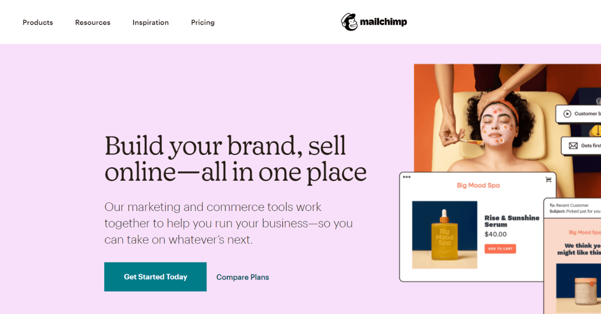
2. Minimalist And Content drill down
Minimalist and Content drill-downs refer to adding compelling visuals that entice users into clicking to know more. Visuals are attractive and can grab people’s attention more quickly than texts.
This can benefit in two ways:
- First, only interested users will click on the visual. They are likely to spend more time on your website, increasing the average time spent and reducing the bounce rate.
- Second, they allow you to fit more content in less space. Also, visitors can scan visuals that matter the most to them quickly.
However, you should follow the best practices to get the most out of your efforts.
- Add compelling visuals to grab users’ attention.
- Use click triggers that communicate benefits to increase the chances of click-through rate further.
- Ensure that you include a CTA and that the button’s text is large enough to attract eyes.
- Use persuasive copy that complements your visuals.
- Ensure that the drill-down is mobile-friendly.
One of the prominent examples of drill-downs is W3Schools. It provides limited content on its homepage with compelling copy, examples, and “learn more” buttons.
3. Minimize Text
While words help you provide information about your products and services, keeping texts to a minimum is essential. Ensure that your website has enough white space so it looks simple yet easy to understand.
One of the best examples of minimizing text and maximizing white space is Google. Their homepage has lots of whitespaces so users can focus on what matters the most: searching for information.
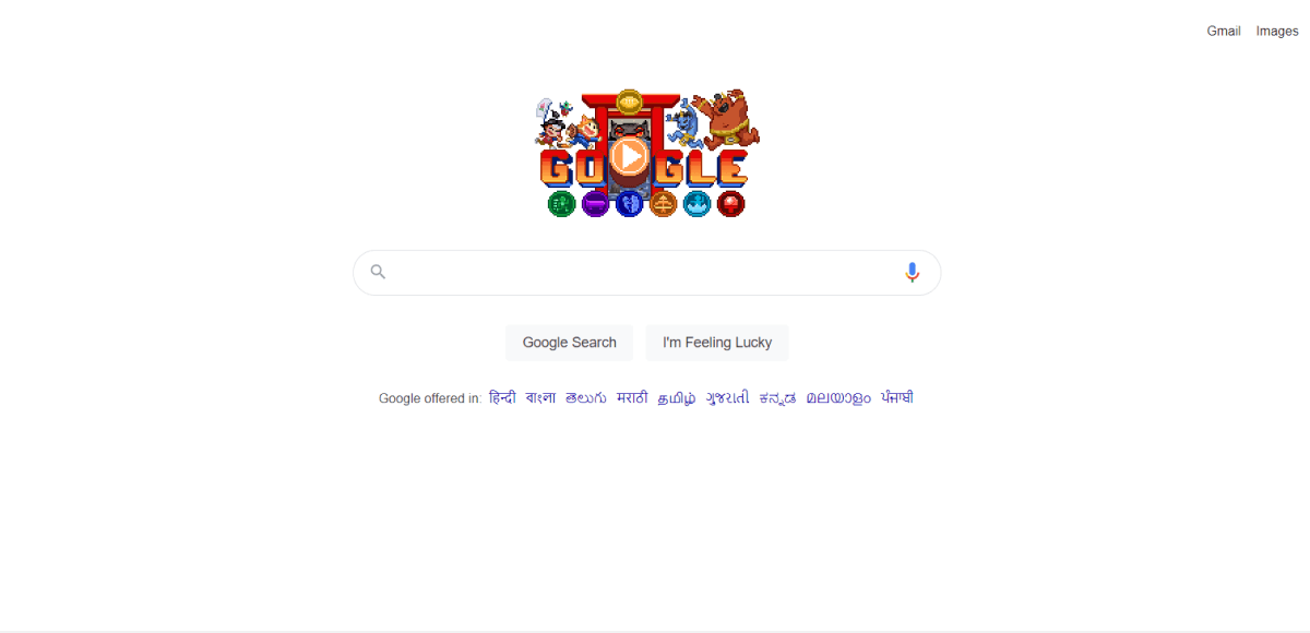
Remember, white space doesn’t necessarily mean that the area needs to be white. Instead, it means empty spaces to make users focus more on your text.
One of the best ways to minimize text while sharing essential details of your product is by leveraging copywriting. It involves writing content in a way that persuades visitors to convert without using too many words.
4. Make Your CTA Stand Out
CTA (call-to-action) button guides users into taking action. Therefore, it should be both compelling and persuasive to generate conversions.
A simple change in a button increased the annual sales of an eCommerce company by $300 million. Therefore, it is crucial to make your call-to-action button stand out.
Here are some ways to make your CTA stand out:
- Leverage color psychology to ensure your button pops up and attracts eyes. For example, if you have a light background, use a little bright color (like orange, blue, or red) to make your CTA stand out.
- Test different button shapes, such as rectangle, round, or rounded edges.
- Test different CTA copies, depending on the action you want to take. This will help determine what works best for your employees.
- Include persuasive words in your CTA, such as you, easy, guarantee, today, new, proven, and free.
- Keep the CTA above the fold. However, you can also try different placements to determine what brings more conversions.
- Use a single CTA on a page. More than one CTA will confuse visitors and reduce the chances of sales.
5. Interactive and Intuitive Designs
Intuitive and interactive design refers to creating simple, meaningful media that encourage users to engage with your website.
Here’s an example to help you better understand what intuitive design is and how you can use it to your benefit.
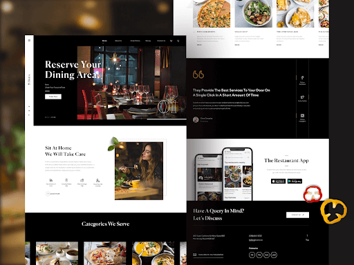
Designed for an eatery, the primary purpose of this page is to highlight the services a restaurant provides. Instead of creating different pages for everything, this page showcases the restaurant’s different services. The black-and-white design makes it even more intuitive.
That said, follow these two strategies to get the most out of this web design trend:
- Your design should be very people-centric. Consider your buyer personas and user scenarios when creating the design.
- Using the design should be effortless. The less time a user pays to figure out how to use your interactive design, the more they can accomplish the task you want.
You can use tools like Figma to create intuitive, interactive designs for your website. It also lets you bring your team together and brainstorm ideas via an online whiteboard.
But remember, intuitive design is meant to make your customers’ life easier, not complex. Thus, make your designs easy to understand and navigate. If you are not sure how to do that, it’s better to take help from expert UI/UX design services to get the desired results with minimal effort.
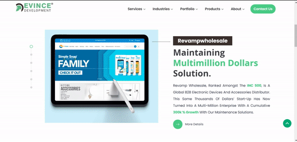
6. Horizontal Scroll
When every website follows the vertical scroll norm, you can stand out by leveraging horizontal scrolling. One of the best website design practices, horizontal scroll, can catch people’s attention, keep them on your site for longer, and make their experience memorable.
However, it is good to know that horizontal scrolling is not ideal for all websites. But if you are creating a:
- Portfolio Website
- Catalog Website
- Online Galleries
For example, Evince Development, A Full-Stack Development Agency, follows the web design best practices for horizontal scroll to showcase its work. However, it also allows visitors to skip an image by directly clicking on the dot (.).
 Follow these horizontal web design best practices to get the most out of your efforts:
- Don’t use horizontal scrolling on the entire webpage. However, you can consider triggering a horizontal animation with a vertical scroll (meaning when a user scrolls vertically, the media comes from the right, i.e., horizontally) to highlight certain sections of your main page.
- Offer other interaction methods alongside horizontal scrolling. For example, an arrow button can do the same function. This will prevent usability issues.
- Design horizontal scrollbars like vertical scrollbars, so they don’t steal the focus. This includes hiding the scrollbar and ensuring that when users scroll down using their mouse, the content appears from the right.
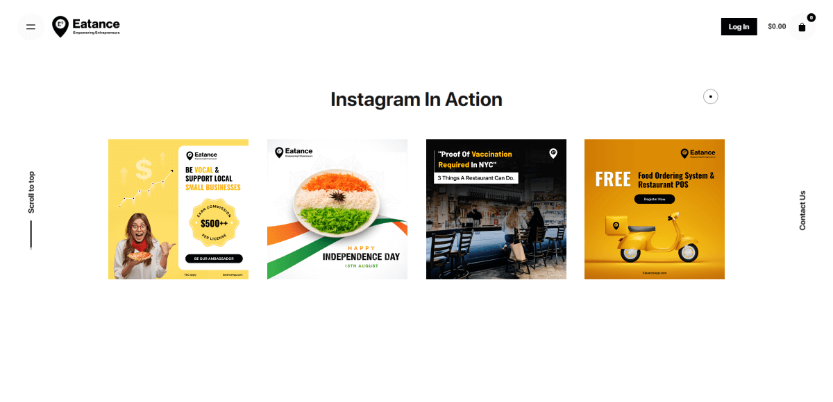
7. Social Media
Integrating social media is vital for every website. It encourages customers to share your products and pages from their social handles, boosting your brand awareness.
To get the most out of this web design trend, you can:
- Create Tumblr blogs and add its link to your website.
- Publish high-quality content on social media and add the feed on your site (to encourage users to follow your social handle) just like Eatance, an on demand marketplace app does it.
- Post regularly on Facebook to let your followers know about your latest offerings (customers are more likely to follow if you publish content regularly).
- Integrate social reviews to build trust with website visitors and encourage them to purchase from you.
Another benefit of adding social buttons on your website is that social shares improve your social signals and drive traffic to your site, indirectly affecting your SEO.
8. Video Embedding
74% of marketers say video has a better return on investment than static images. In addition, 87% of marketers say video has increased traffic to their website.
That’s not it. Here are some more statistics about video embedding:
- 94% of people report watching explainer videos to learn more about a product, with 84% ending up making a purchase.
- The average user spends 88% more time on a website with video.
- Over 82% of internet traffic will be online videos by 2022.
These numbers themselves indicate the importance of video embedding in the website. However, it needs to be done efficiently. If not, it will increase your page’s weight, directly affecting the loading time.
Here is how you can leverage this web design trend to get the most out of your efforts:
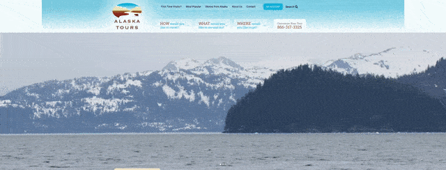
Place short videos on the top section of your homepage. Make sure it autoplay (without sound) when a user lands on your website. Alaska Tours is a great example of a website that leverages video at the top of the site.
- Use a single video on a page to prevent users from getting distracted.
- Add CTA to your video to increase engagement. You can also allow users to view the video on full screen to highlight its importance.
- Make sure the text in your website complements the information in the video for a more accessible experience.
One way to embed videos on your site is by uploading them to your server, just like you would for an image file. However, since video files tend to be large, it can strain your storage limits and website loading speed.
Another way to embed videos is by using a third-party service or a CDN (Content Delivery Network). Third-party video hosting services like YouTube, Vimeo, and Vidyard allow you to embed videos without affecting your site’s weight.
9. Use of Negative Colors and Dark Theme
The dark mode is a low-light interface that uses a dark color (like black or dark grey) as the background color.
Dark themes and negative colors are among the best web design trends that have recently gained much traction. For example, Instagram and Twitter have a dark mode for mobile users.
Dark mode reduces eye strain, especially when browsing the website at night, increases visibility in low-ambient lighting, and increases focus.
Here’s how to make the best website design using negative colors and dark theme:
- Use dark grey instead of pure black as it has less contrast and makes the site look more appealing.
- Ensure your content is easy to read in a dark theme. You can use lighter tones (colors in the 200-50 range) as they have better readability in dark backgrounds. We recommend using a text-to-background contrast level of 15.8:1.
- Avoid using fully saturated colors on dark backgrounds.
- Use the right “on” colors on your text to make it more readable.
- If you have a light or standard mode, don’t just invert the colors to get the dark theme. Instead, choose all your elements carefully to provide the best experience to your visitors.
Wrapping Up
Following the best web design increases your chances of providing a memorable experience and converting visitors into customers. The seven web design trends can help you stand out from the crowd and enhance the overall experience.
Not sure how to create the best website design? Leverage EvinceDev’s Custom Web Design Services to get a compelling, persuasive website and increase your conversion rates. You can also check out its Graphics Portfolio to help you make the decision.
Are you already have a website and looking to redesign it. Check Website redesign guide 2023.